webinar-redesign.png

CivicPlus Webinar Redesign


 CivicPlus Webinar redesign and branding

Lead Visual Designer and Production Designer

When I started at CivicPlus in February, I was the first designer added back in-house after they had been working with an outside agency. The Creative Director had just begun a brand refresh for the website civicplus.com. My job was to refresh all the webinar designs to make them align with the new brand's look and feel.


Old webinar design Styling

Process

I first began by setting up meetings with the people who work directly with the webinars at CivicPlus. I wanted to hear from them on what they liked and didn’t like about the current state of graphics and anything new they wanted to add. They know the audience for these webinars firsthand, so I knew it was crucial to meet with them first. The webinar team wanted to ensure that we included headshots of the speakers when we could because those performed best, and that the cta didn’t need to look like a button unless it was paid media, because organic social images aren’t clickable.

Once that happened, I began exploring images on Dribbble, Pinterest, and Behance for inspiration. I also used ChatGPT for ideas on how to set up the webinar copy and imagery.

 

Competitor research and inspiration


Webinar Design First Round

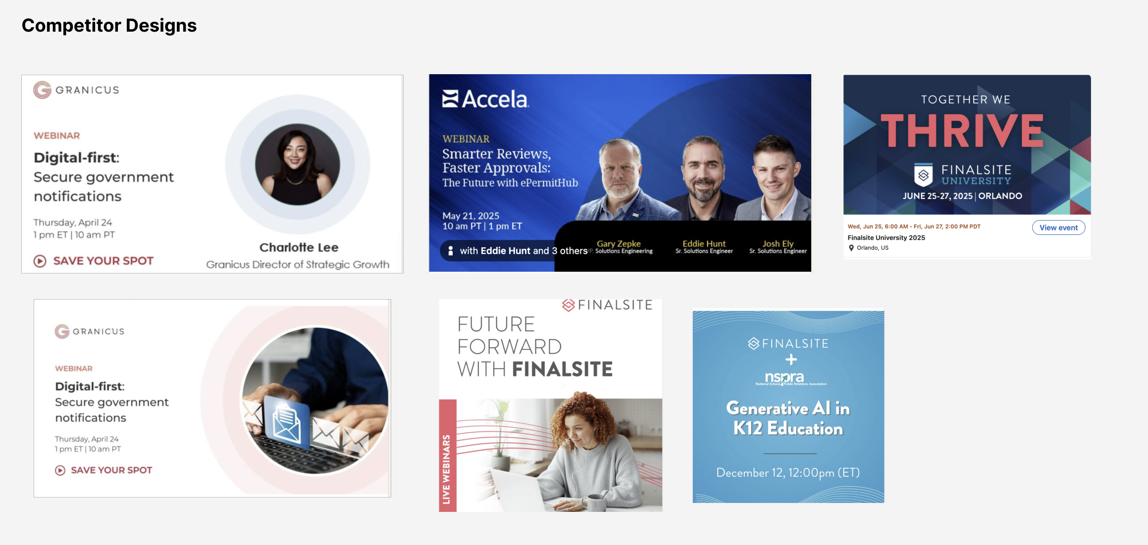
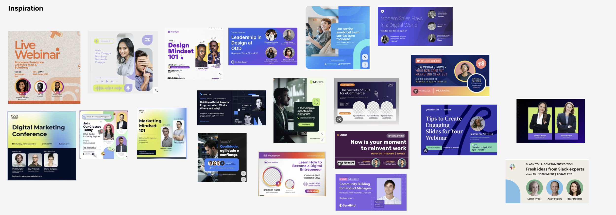
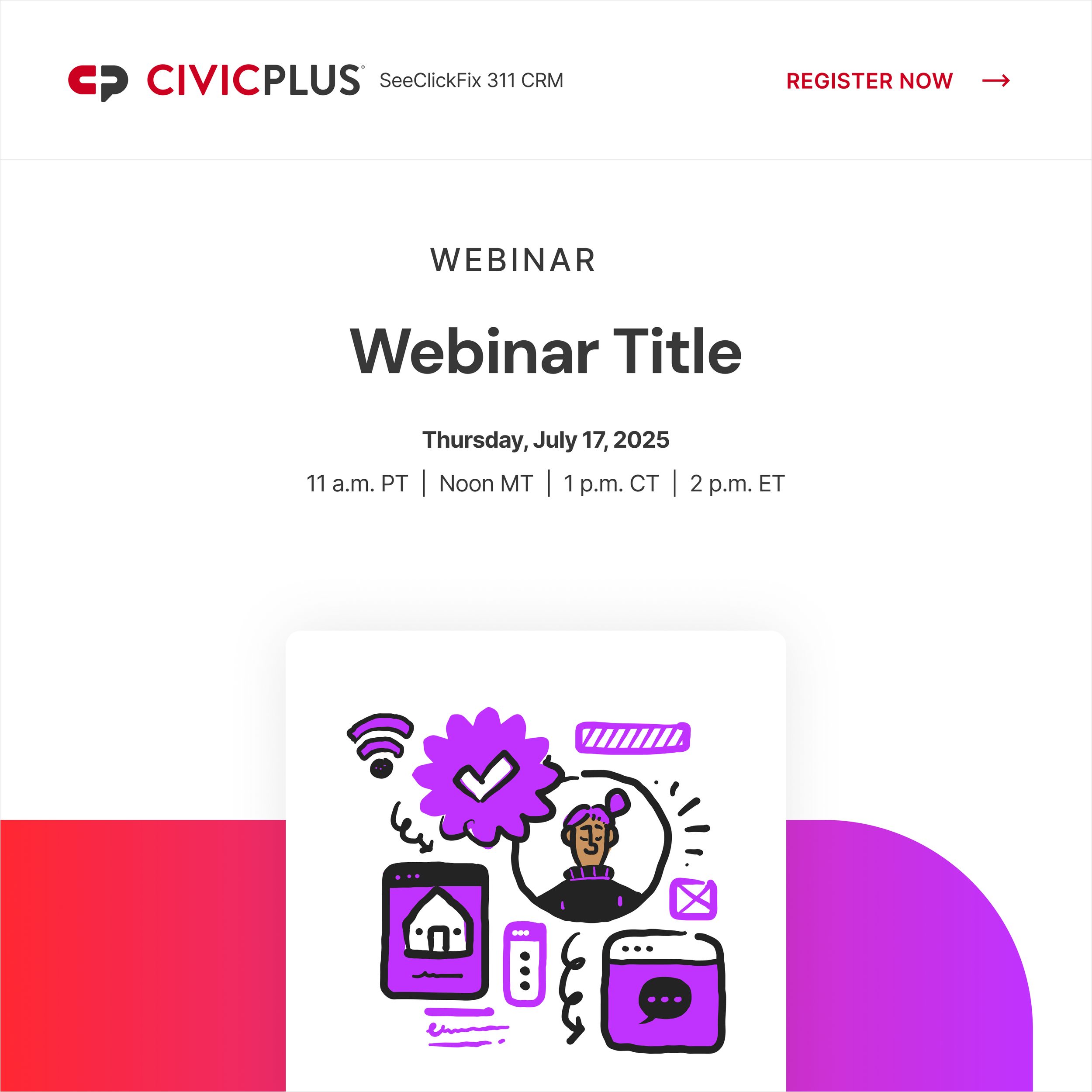
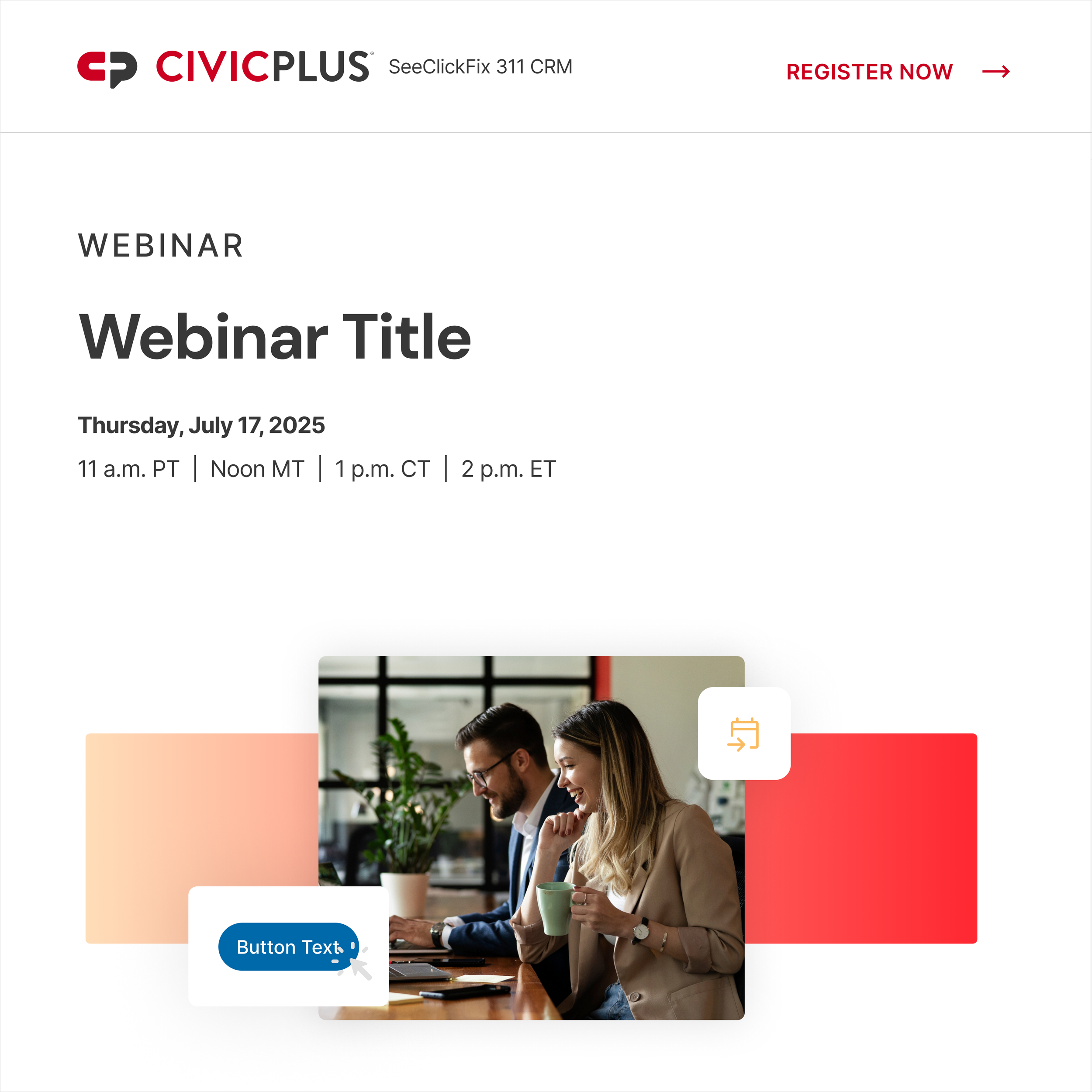
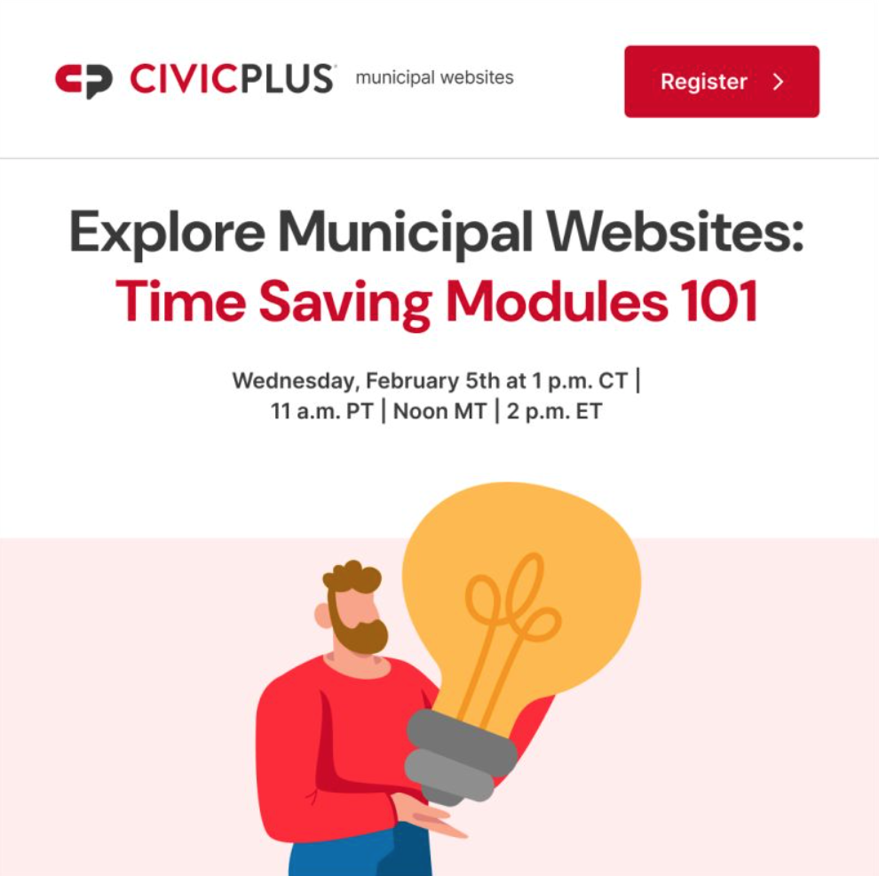
Once i was done with research, I start messing around with different layouts. The scope was to create a template for 1, 2, 3, and 4 speaker photos and one version where it would be stock photography or an illustration.


Final Layout