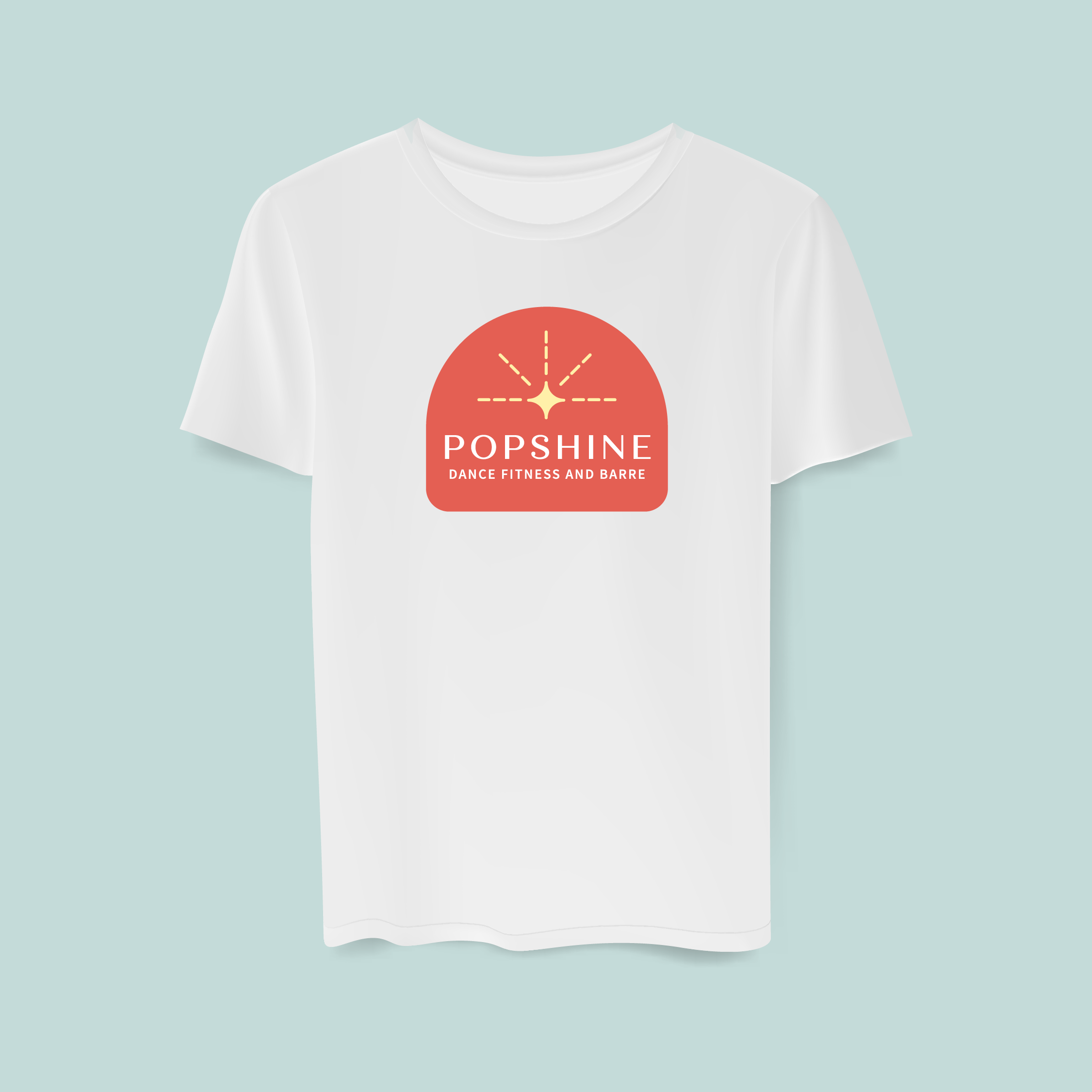
Popshine Branding Project
Role: Brand and Illustration
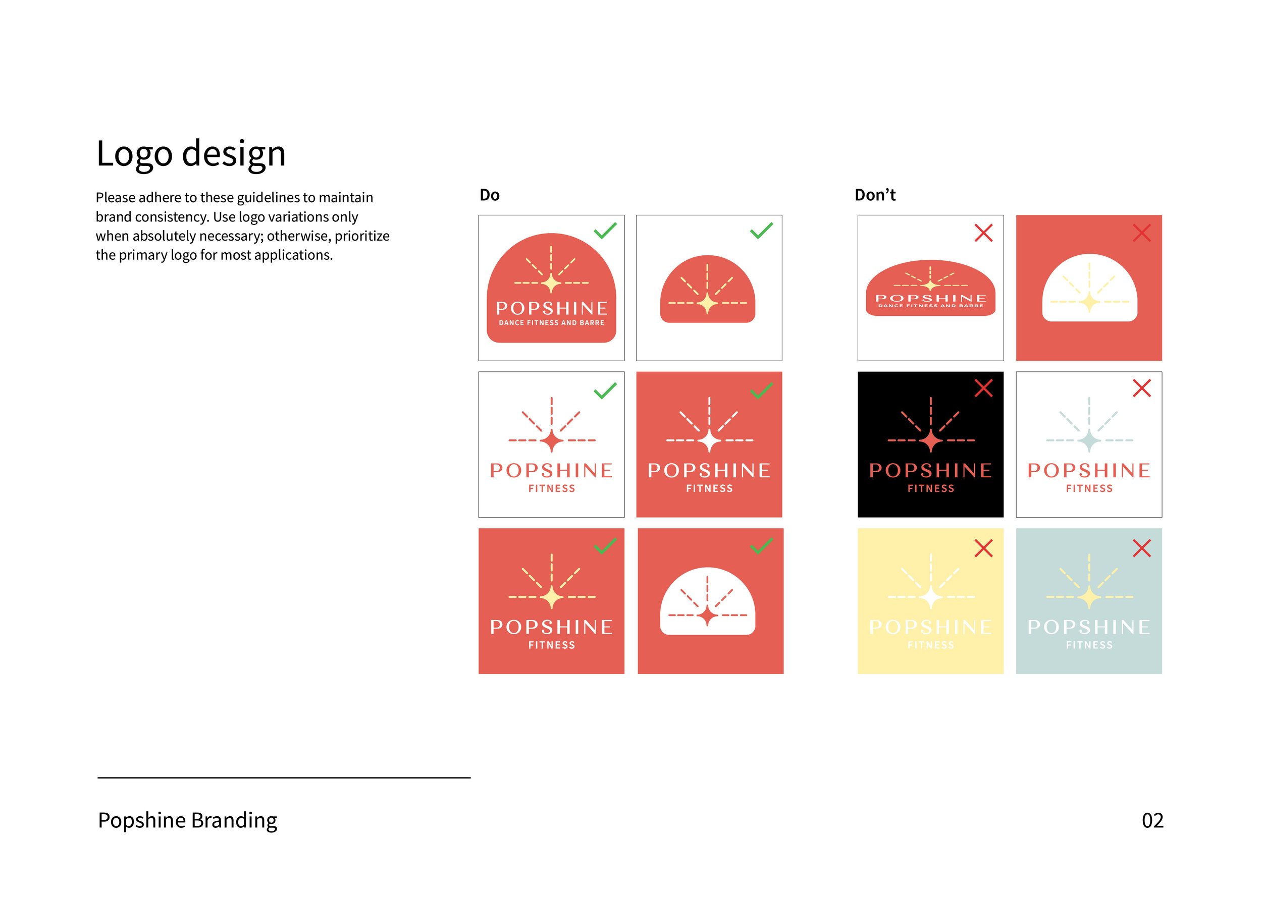
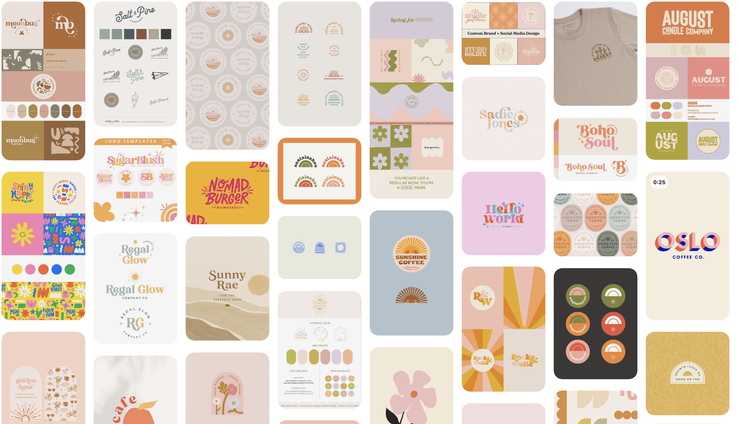
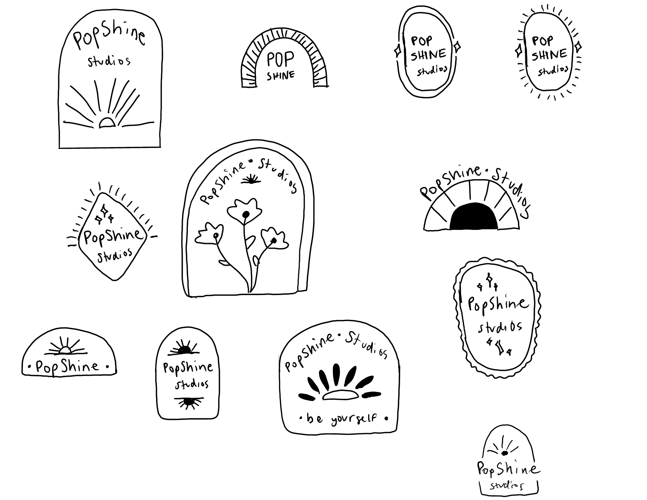
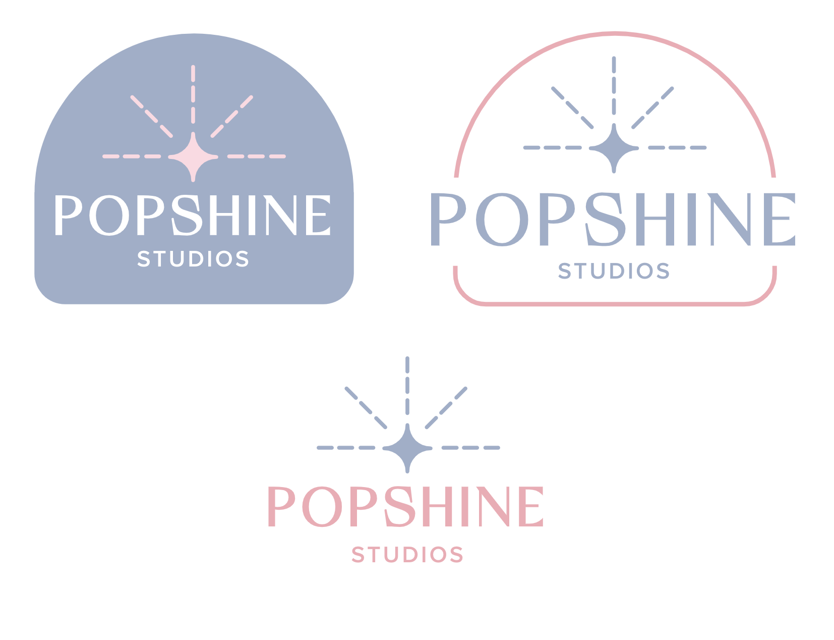
In preparation for their upcoming launch, I collaborated closely with a client to develop a complete brand identity for their barre and dance fitness company. My role included designing the logo, selecting primary and secondary fonts, and crafting a vibrant color palette featuring pinks, purples, and yellows to convey a fun and inviting atmosphere. Through regular discussions, I ensured that each element aligned seamlessly with the client’s vision, resulting in a cohesive and engaging brand experience.


